UX/UI Service Design Project
Ministry of Environment and Climate Change Strategy
A UX design case study on streamlining the application process for those involved in identifying, investigating, managing, or cleaning up contaminated sites.

Role & Team
Role: Sole UX/UI Service DesignerTeam: 1 Architect, 4 Developers, 1 Product Owner, 1 Product Manager
Contaminated Sites Forms
Site Remediation Services provides many services to clients. To request a service, an application is submitted. This process involves the completion, submission and acceptance of forms. It might be helpful to think of the service application package as a recipe, and the forms as some of the ingredients. Different services will require different forms (along with other submission requirements). Some forms will be common to most services, while other forms will only be required for specific types of services.
Problem Statement
How might we improve the existing LRS contaminated site services application process so that applicants are more successful in applying for LRS certification documents, and staff are more efficient with processing applications.
User Research: Who Did We Engage
I Conducted ten 45-minute virtual user interviews with a diverse group of stakeholders to uncover pain points, user goals, and contextual challenges within the contaminated site application process. These sessions provided critical qualitative insights that informed persona development, service improvement opportunities, and the overall UX strategy.Roles
Senior Manager, Operations Manager, 2 x Principles, Environmental Co-ordinator, Society President, Assistant Manager, Lands Executive Assistant, Compliance and Enforcement Officer, Senior Planner.
Gender
8 Men | 2 Women
Ages
30-40: 1 | 40-50: 8 | 50-60: 1
Organizations
City of Vancouver, City of Richmond, Sts'ailes First Nation,
Tsawwassen First Nation, Conwest Group, Thurber Engineering,
Pinchin, Keystone Environment, Williams Lake Golf Club.
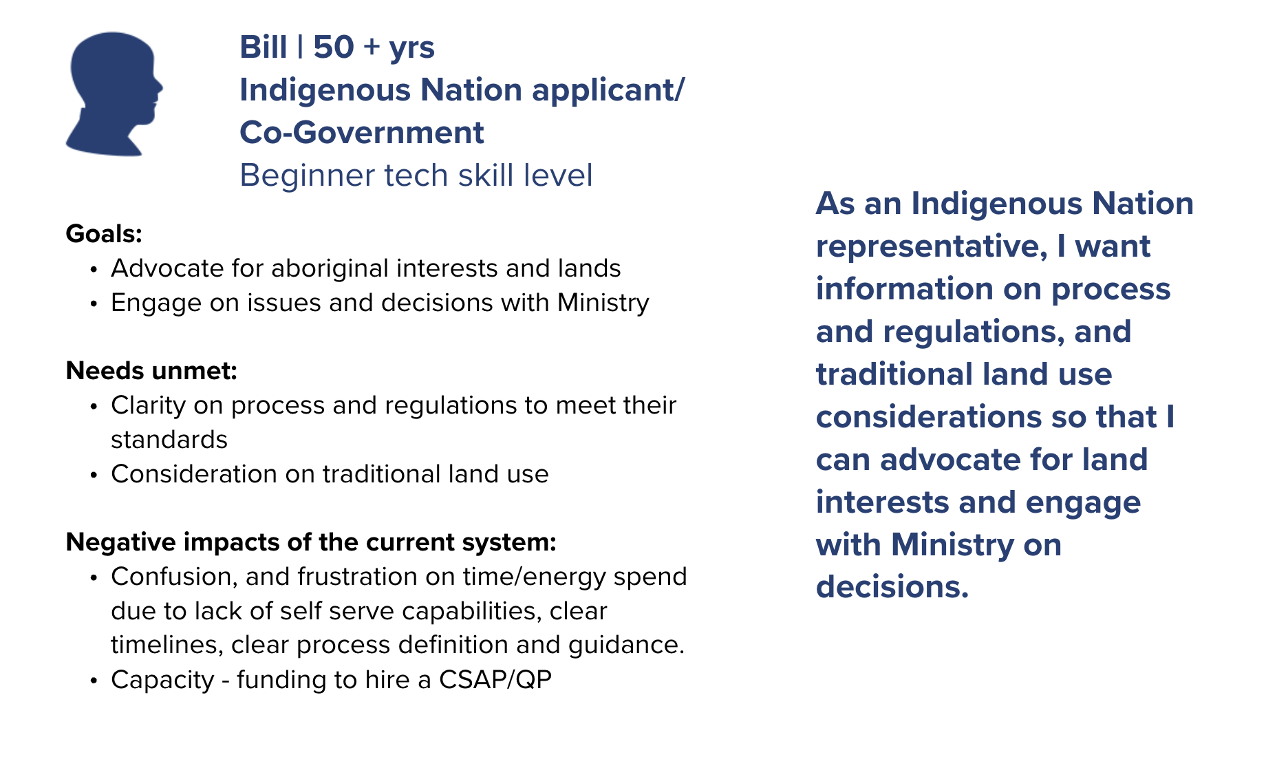
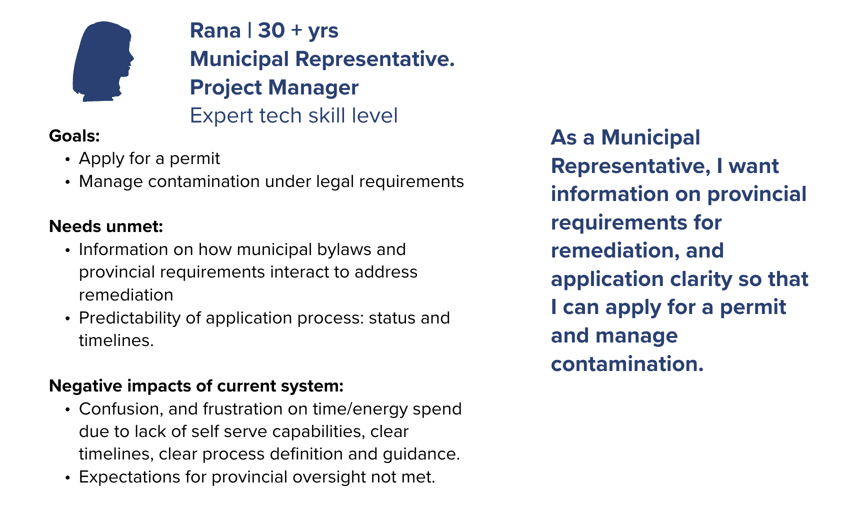
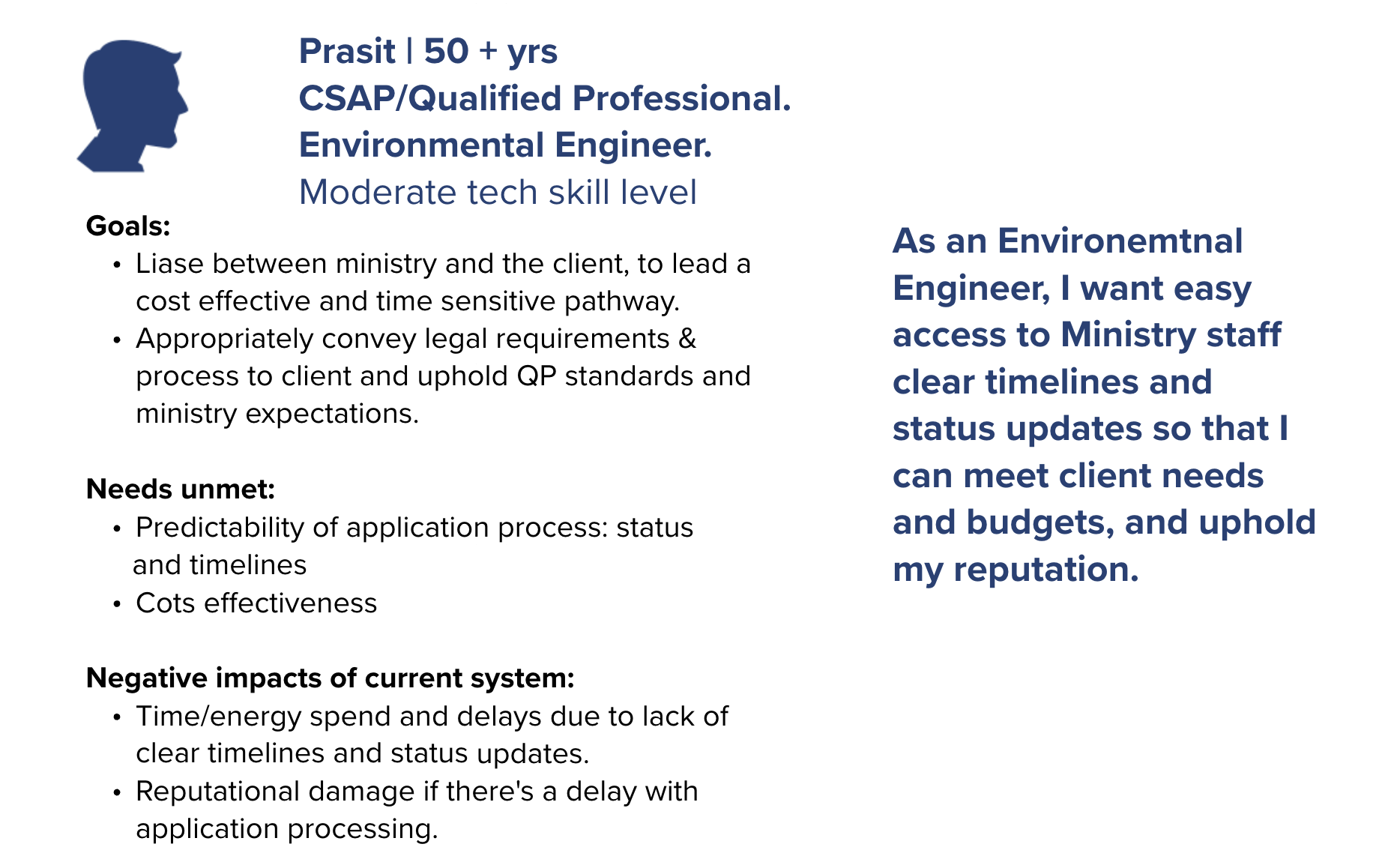
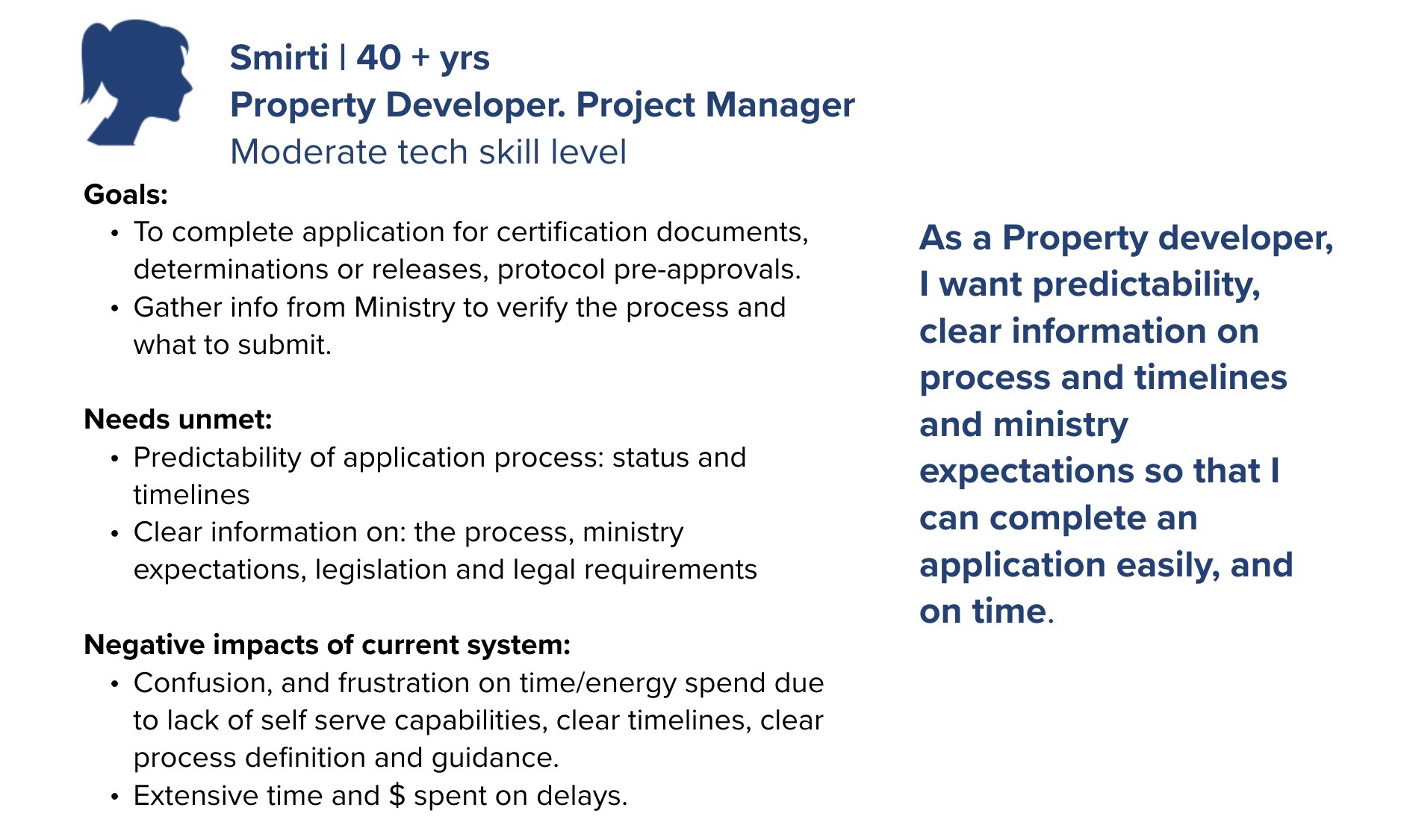
Personas
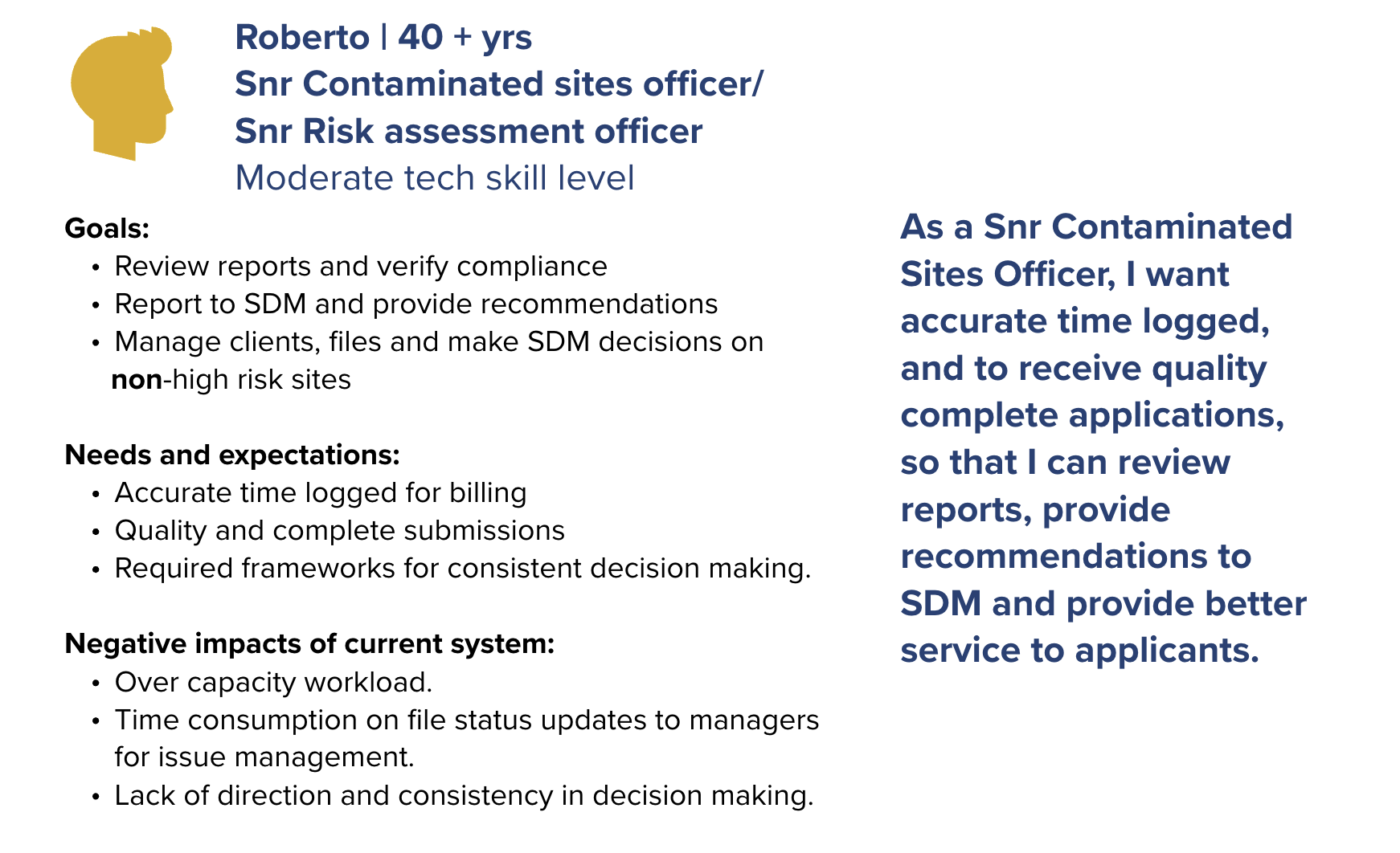
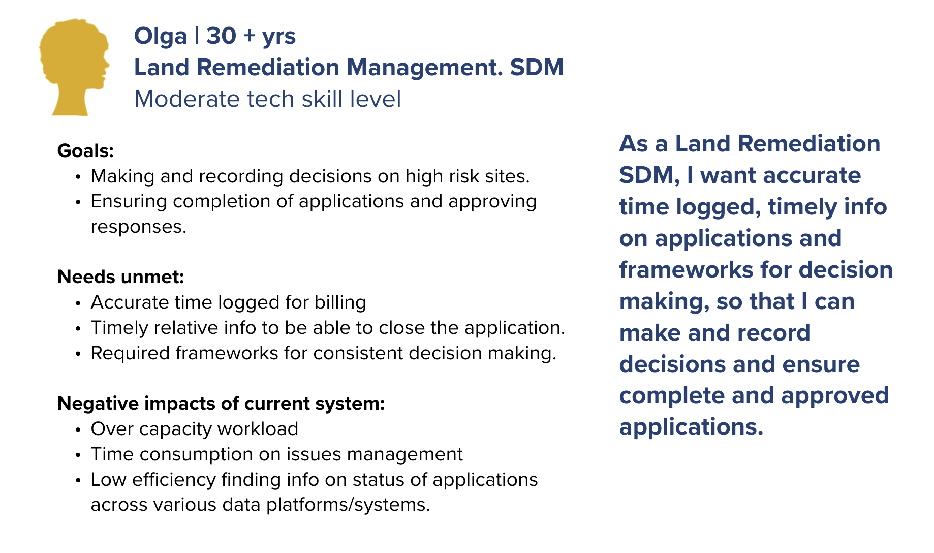
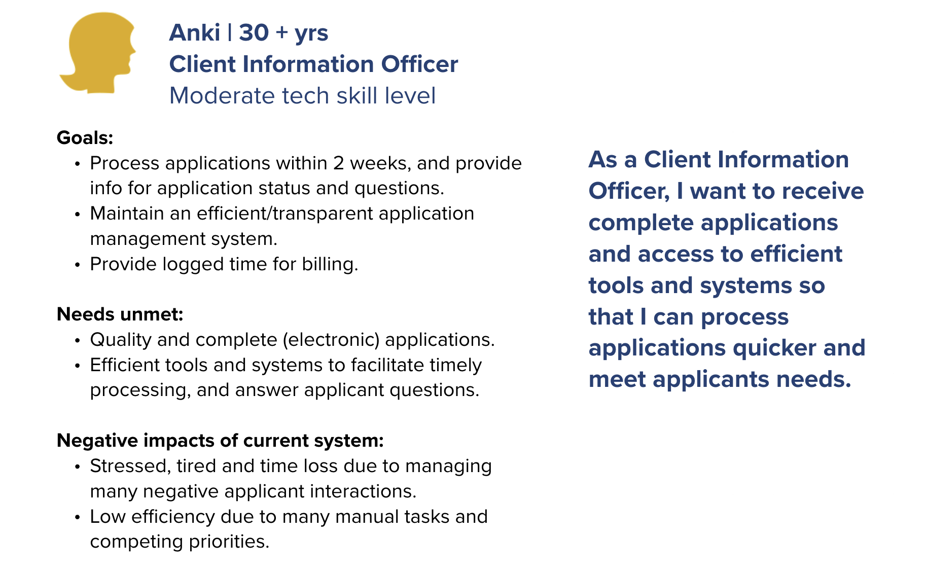
As part of the Site Remediation Services UX design project, personas were developed to represent the diverse external users involved in the application process for contaminated site services. Drawing from ten 45-minute virtual interviews with professionals across government, First Nations, environmental consulting firms, and private organizations, I synthesized insights into distinct user profiles. Participants included roles such as operations managers, environmental coordinators, senior planners, and compliance officers each with varying levels of experience navigating the Land Remediation Section (LRS) application process. These personas captured user goals, pain points, workflows, and contextual needs, providing a clear lens into the challenges applicants faced, such as confusion around form requirements and inefficient submission pathways. By grounding the design process in these research-backed personas, we ensured that future service improvements would be tailored to real user needs and aligned with the problem statement: helping applicants submit more successful applications while enabling staff to process them more efficiently.
Research Key Pain Points
Content
- Complex process that is very challenging to navigate: what to do, when and why
- Uncertainty on requirements for certain applications
- Unclear on best course of action for scenarios
- Protocol 12 information importance and accessibility
- No information on warnings or triggers that can guide how to engaging with the land
Digital and Service System
- Timelines are unknown, inconsistent and too long, creating impactful delays
- Many forms are not user friendly
- No status updates on the progress of applications, reports or enforcements
- Not easy to access to the registry for all stakeholders
- No information on what and where remediation activity is happening
Culture and Context
- Centralized email, standard responses and minimal access to Ministry staff
- FAQ response times are slow
- Contact information is not easy to find
- Setting up and having a meeting takes too long
- No contact with reviewer to know if site visits occur for AIP or COC
- All applicants given the same priority: Municipality, CSAP, Citizen
- Differing standards on processing applications between generations of staff
- Disconnect with Indigenous Nations on remediation planning
- Siloed work around supporting and enforcing environmental protection
Opportunities for Improvement
Guidance & Content Clarity
- Develop a guided application wizard or decision tree tool to walk users through steps based on their scenario.
- Create visual flowcharts and timelines for each application type.
- Build interactive checklists tailored by application type.
- Offer auto-generated requirement lists after users select key service attributes.
- Provide scenario-based guidance or a self-assessment tool that suggests next steps.
- Include examples of completed applications and common pathways.
- Redesign content layout for Protocol 12 guidance and include quick-reference summaries.
- Integrate Protocol 12 requirements into digital forms or wizards with contextual tips.
- Create a centralized contact directory with filters by topic, region, or role.
- Include contact cards or quick links directly in application pages.
Digital Experience & Tools
- Redesign forms using plain language, dynamic inputs, and conditional logic.
- Offer form previews, autofill from user profiles, and in-form help prompts.
- Improve the search functionality and user interface of the public registry.
- Create role-based access and dashboards for different user types.
- Develop an online portal with real-time status tracking and notification options.
- Allow users to subscribe to updates or view a timeline of progress.
- Launch a public map of current remediation activities and project stages.
- Publish monthly or quarterly project updates for transparency.
- Build a searchable, dynamic FAQ database that updates based on user input.
- Add a chatbot or virtual assistant for instant answers on common topics.
- Introduce a public map or alert system showing environmental triggers, regulatory overlays, or sensitive zones.
- Include land use flags or notices within the application process for early guidance.
Process Transparency & Timeliness
- Display estimated timelines by application type and stage.
- Introduce a public service standard dashboard with real-time metrics.
- Add status updates that indicate if a site visit is pending, completed, or waived.
- Introduce prioritization logic based on urgency, impact, and applicant type.
- Add service tiers or expedite options based on predefined criteria.
Communication & Support
- Introduce a tiered support model with dedicated contact options by application complexity.
- Use a case management system to assign consistent staff to files.
- Offer online appointment booking with calendar integrations and auto-confirmations.
- Introduce “office hours” with drop-in slots for quick consultations.
- Allow users to message or request updates from assigned reviewers through the portal.
Wireframes & Prototyping
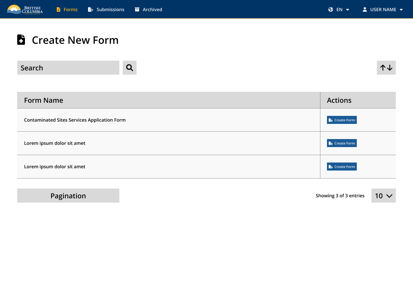
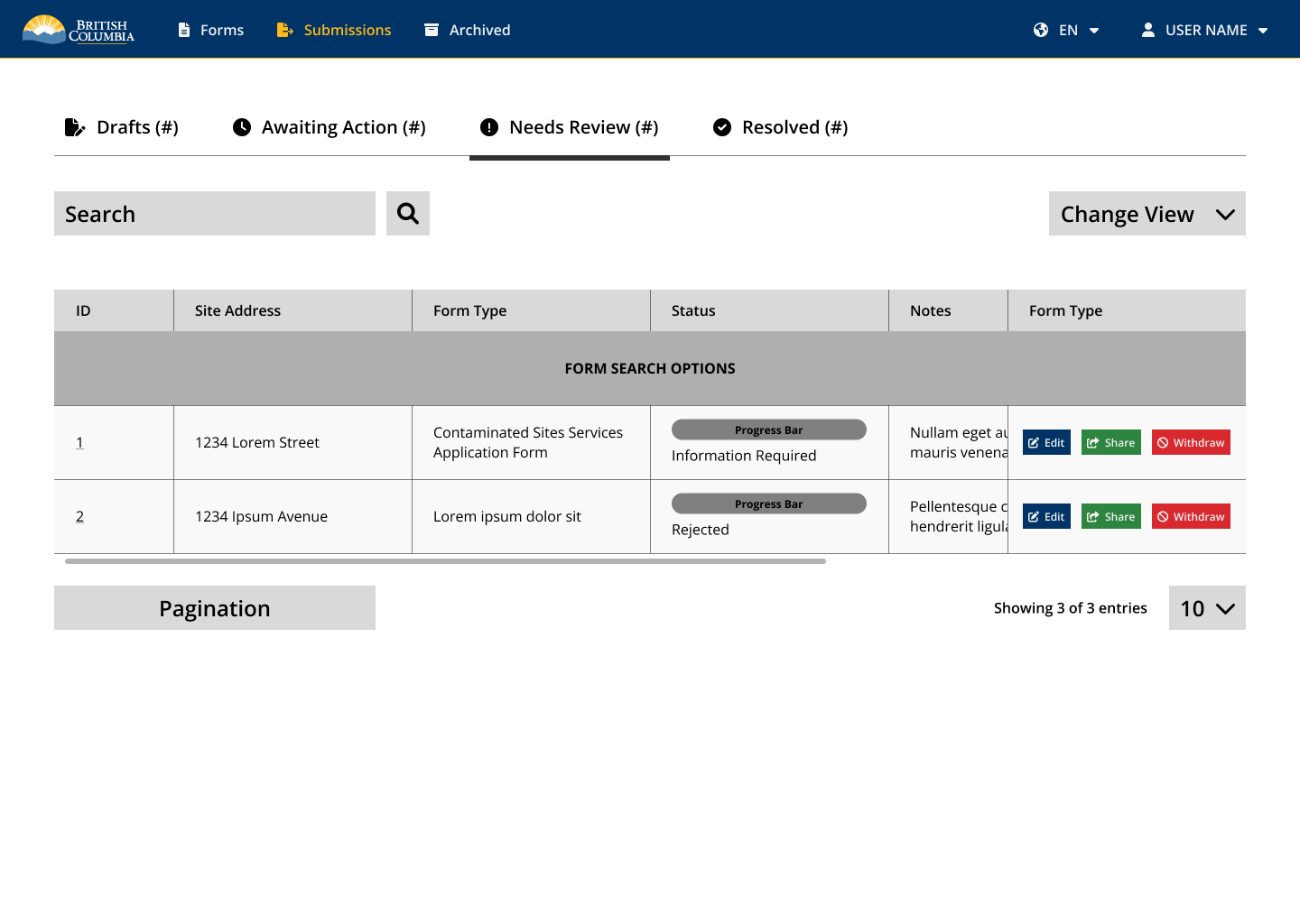
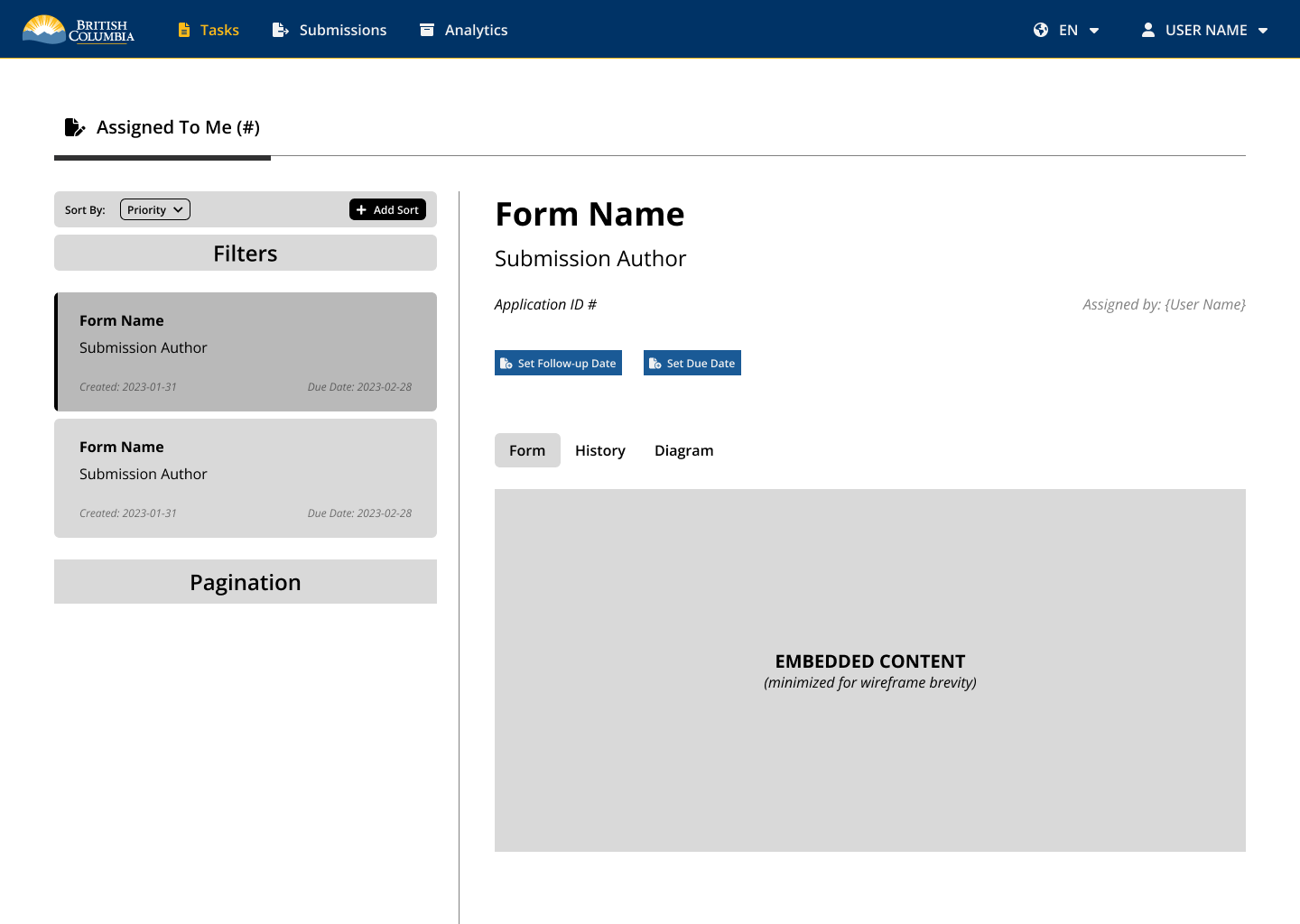
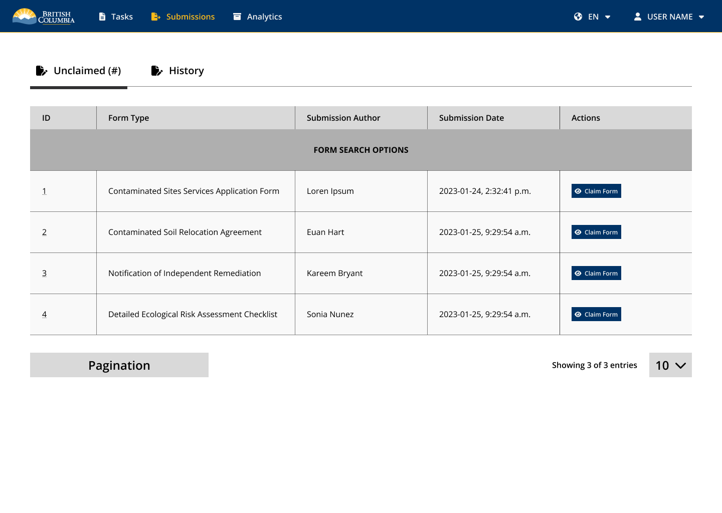
Prototyping for the Site Remediation Services app focused on designing tailored experiences for both internal and external users. For external users, prototypes aimed to simplify the application process by improving form usability, introducing guided workflows, and ensuring mobile responsiveness. Internal user prototypes were designed to streamline review workflows, enhance visibility into application status, and support decision-making with clearer dashboards and user notifications. Both sets of prototypes were developed iteratively in Figma, tested with target users, and aligned with accessibility standards and the BC Gov Design System to ensure usability, consistency, and scalability across platforms.
External User Wireframes
Internal User Wireframes
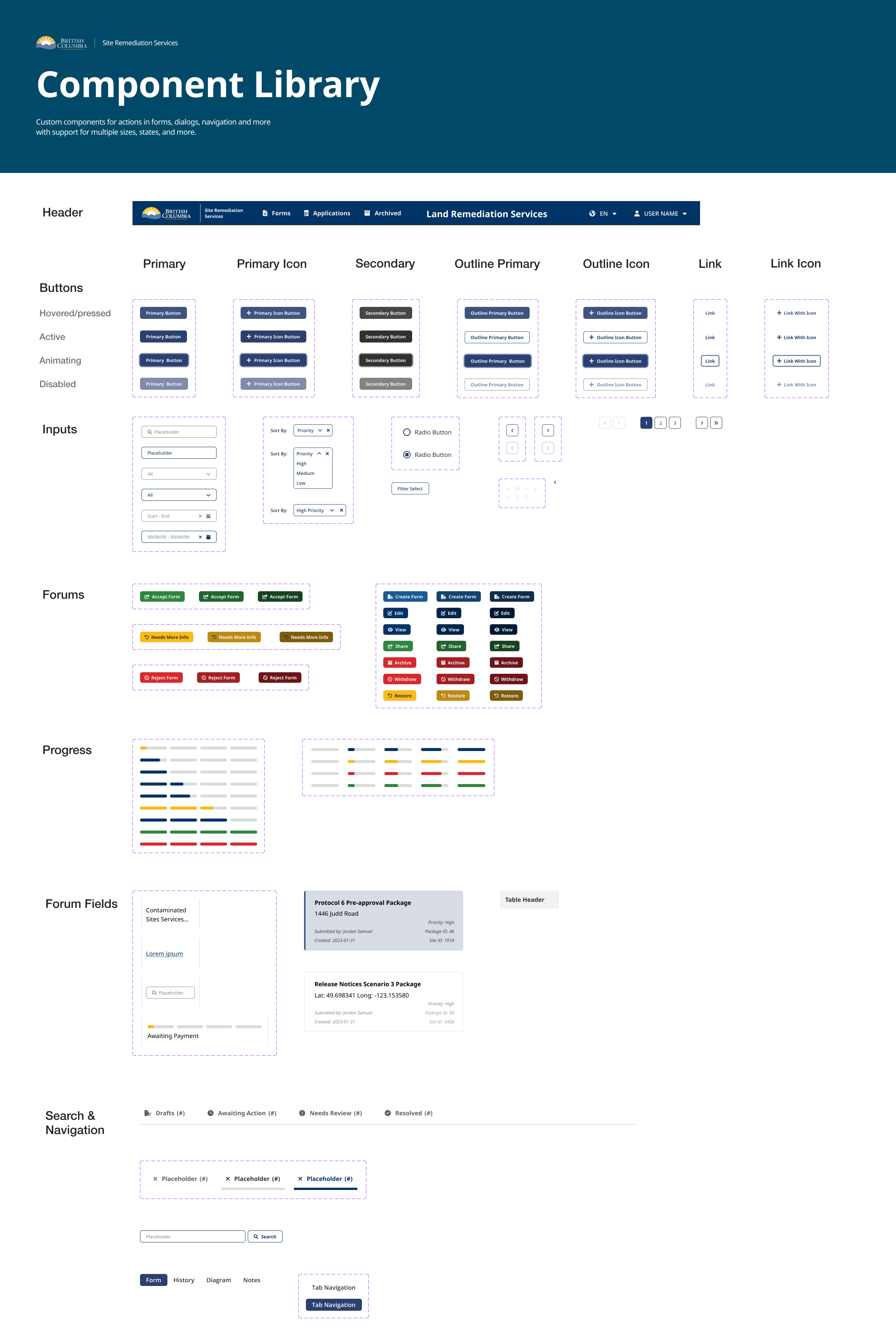
Design System / Component Library
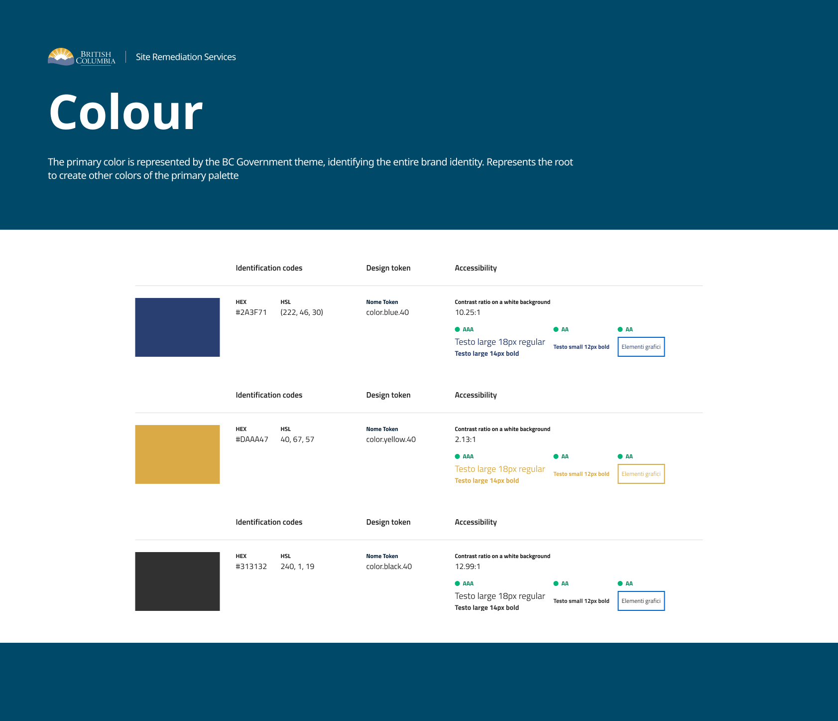
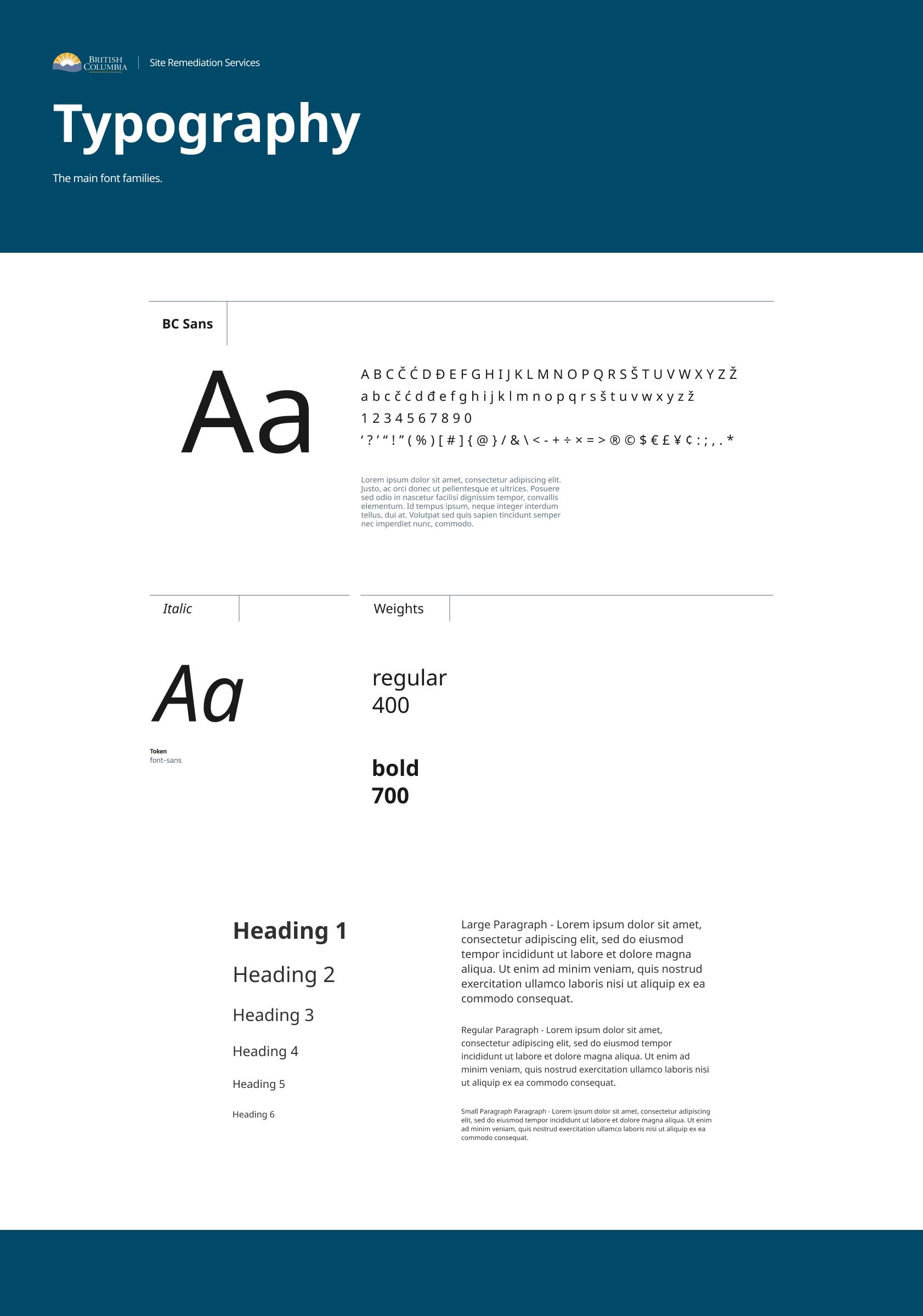
As part of the Site Remediation Services project, a component library and design system was developed to ensure consistency, accessibility, and efficiency across all interfaces. The system included foundational elements such as typography, color palette, navigation components, buttons, input fields, and progress bars. It incorporated selected components from the BC Gov Design System to maintain alignment with provincial standards, while also introducing custom components tailored to the unique needs of the application process, such as multi-step form elements and contextual alerts. The library was built in Figma to support rapid prototyping, collaboration, and handoff, and served as a centralized reference for both internal and external user interface design.
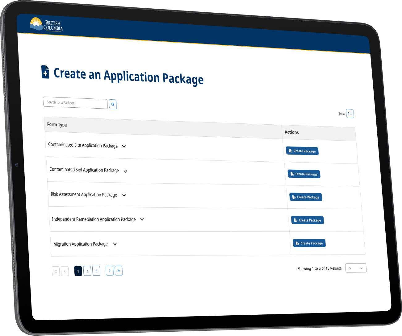
High Fidelity - External User
The high-fidelity mockups for the Create Application Package and Application Package Dashboard offer a streamlined experience for external users. The package builder guides users through each step with real-time validation and contextual help. The dashboard displays all applications submitted, in progress, or drafts with clear status indicators, filter options, and quick actions, making it easy to manage and track submissions.
High Fidelity - Internal User
The high-fidelity pages for internal users feature an Application Dashboard optimized for clarity and operational efficiency. Each application includes real-time status indicators such as submitted, under review, or action required—helping staff quickly assess and prioritize workload. A built-in interactive map function displays location markers for each application, allowing users to visualize geographic distribution and zoom into specific areas for more detail. This spatial view is accessible directly from the dashboard and within each application record, supporting site verification and land-based decision-making without switching contexts.
Reflection
This case study highlights how user research and design thinking helped improve the application process for contaminated site services. By interviewing real users from different organizations, the team identified key problems: the process was confusing, forms were hard to use, and applicants had little insight into their application status. The new design introduced guided application tools, clearer forms, and dashboards to track progress, making it easier for applicants to know what to do and for staff to process requests efficiently. Prototyping and user testing ensured the changes met real needs, while a consistent design system kept everything accessible and user-friendly. Overall, the project shows the value of listening to users and making digital services simpler and more transparent


UX/UI Service Design Project
Ministry of Environment and Climate Change Strategy
A UX design case study on streamlining the application process for those involved in identifying, investigating, managing, or cleaning up contaminated sites.
Role & Team
Role: Sole UX/UI Service DesignerTeam: 1 Architect, 4 Developers, 1 Product Owner, 1 Product Manager
Contaminated Sites Forms
Site Remediation Services provides many services to clients. To request a service, an application is submitted. This process involves the completion, submission and acceptance of forms. It might be helpful to think of the service application package as a recipe, and the forms as some of the ingredients. Different services will require different forms (along with other submission requirements). Some forms will be common to most services, while other forms will only be required for specific types of services.
Problem Statement
How might we improve the existing LRS contaminated site services application process so that applicants are more successful in applying for LRS certification documents, and staff are more efficient with processing applications.
User Research: Who Did We Engage
I Conducted ten 45-minute virtual user interviews with a diverse group of stakeholders to uncover pain points, user goals, and contextual challenges within the contaminated site application process. These sessions provided critical qualitative insights that informed persona development, service improvement opportunities, and the overall UX strategy.Roles
Senior Manager, Operations Manager, 2 x Principles, Environmental Co-ordinator, Society President, Assistant Manager, Lands Executive Assistant, Compliance and Enforcement Officer, Senior Planner.
Gender
8 Men | 2 Women
Ages
30-40: 1 | 40-50: 8 | 50-60: 1
Organizations
City of Vancouver, City of Richmond, Sts'ailes First Nation,
Tsawwassen First Nation, Conwest Group, Thurber Engineering,
Pinchin, Keystone Environment, Williams Lake Golf Club.
Personas
As part of the Site Remediation Services UX design project, personas were developed to represent the diverse external users involved in the application process for contaminated site services. Drawing from ten 45-minute virtual interviews with professionals across government, First Nations, environmental consulting firms, and private organizations, I synthesized insights into distinct user profiles. Participants included roles such as operations managers, environmental coordinators, senior planners, and compliance officers each with varying levels of experience navigating the Land Remediation Section (LRS) application process. These personas captured user goals, pain points, workflows, and contextual needs, providing a clear lens into the challenges applicants faced, such as confusion around form requirements and inefficient submission pathways. By grounding the design process in these research-backed personas, we ensured that future service improvements would be tailored to real user needs and aligned with the problem statement: helping applicants submit more successful applications while enabling staff to process them more efficiently.
Research Key Pain Points
Content
- Complex process that is very challenging to navigate: what to do, when and why
- Uncertainty on requirements for certain applications
- Unclear on best course of action for scenarios
- Protocol 12 information importance and accessibility
- No information on warnings or triggers that can guide how to engaging with the land
Digital and Service System
- Timelines are unknown, inconsistent and too long, creating impactful delays
- Many forms are not user friendly
- No status updates on the progress of applications, reports or enforcements
- Not easy to access to the registry for all stakeholders
- No information on what and where remediation activity is happening
Culture and Context
- Centralized email, standard responses and minimal access to Ministry staff
- FAQ response times are slow
- Contact information is not easy to find
- Setting up and having a meeting takes too long
- No contact with reviewer to know if site visits occur for AIP or COC
- All applicants given the same priority: Municipality, CSAP, Citizen
- Differing standards on processing applications between generations of staff
- Disconnect with Indigenous Nations on remediation planning
- Siloed work around supporting and enforcing environmental protection
Opportunities for Improvement
Guidance & Content Clarity
- Develop a guided application wizard or decision tree tool to walk users through steps based on their scenario.
- Create visual flowcharts and timelines for each application type.
- Build interactive checklists tailored by application type.
- Offer auto-generated requirement lists after users select key service attributes.
- Provide scenario-based guidance or a self-assessment tool that suggests next steps.
- Include examples of completed applications and common pathways.
- Redesign content layout for Protocol 12 guidance and include quick-reference summaries.
- Integrate Protocol 12 requirements into digital forms or wizards with contextual tips.
- Create a centralized contact directory with filters by topic, region, or role.
- Include contact cards or quick links directly in application pages.
Digital Experience & Tools
- Redesign forms using plain language, dynamic inputs, and conditional logic.
- Offer form previews, autofill from user profiles, and in-form help prompts.
- Improve the search functionality and user interface of the public registry.
- Create role-based access and dashboards for different user types.
- Develop an online portal with real-time status tracking and notification options.
- Allow users to subscribe to updates or view a timeline of progress.
- Launch a public map of current remediation activities and project stages.
- Publish monthly or quarterly project updates for transparency.
- Build a searchable, dynamic FAQ database that updates based on user input.
- Add a chatbot or virtual assistant for instant answers on common topics.
- Introduce a public map or alert system showing environmental triggers, regulatory overlays, or sensitive zones.
- Include land use flags or notices within the application process for early guidance.
Process Transparency & Timeliness
- Display estimated timelines by application type and stage.
- Introduce a public service standard dashboard with real-time metrics.
- Add status updates that indicate if a site visit is pending, completed, or waived.
- Introduce prioritization logic based on urgency, impact, and applicant type.
- Add service tiers or expedite options based on predefined criteria.
Communication & Support
- Introduce a tiered support model with dedicated contact options by application complexity.
- Use a case management system to assign consistent staff to files.
- Offer online appointment booking with calendar integrations and auto-confirmations.
- Introduce “office hours” with drop-in slots for quick consultations.
- Allow users to message or request updates from assigned reviewers through the portal.
Wireframes & Prototyping
Prototyping for the Site Remediation Services app focused on designing tailored experiences for both internal and external users. For external users, prototypes aimed to simplify the application process by improving form usability, introducing guided workflows, and ensuring mobile responsiveness. Internal user prototypes were designed to streamline review workflows, enhance visibility into application status, and support decision-making with clearer dashboards and user notifications. Both sets of prototypes were developed iteratively in Figma, tested with target users, and aligned with accessibility standards and the BC Gov Design System to ensure usability, consistency, and scalability across platforms.
External User Wireframes
Internal User Wireframes
Design System / Component Library
As part of the Site Remediation Services project, a component library and design system was developed to ensure consistency, accessibility, and efficiency across all interfaces. The system included foundational elements such as typography, color palette, navigation components, buttons, input fields, and progress bars. It incorporated selected components from the BC Gov Design System to maintain alignment with provincial standards, while also introducing custom components tailored to the unique needs of the application process, such as multi-step form elements and contextual alerts. The library was built in Figma to support rapid prototyping, collaboration, and handoff, and served as a centralized reference for both internal and external user interface design.
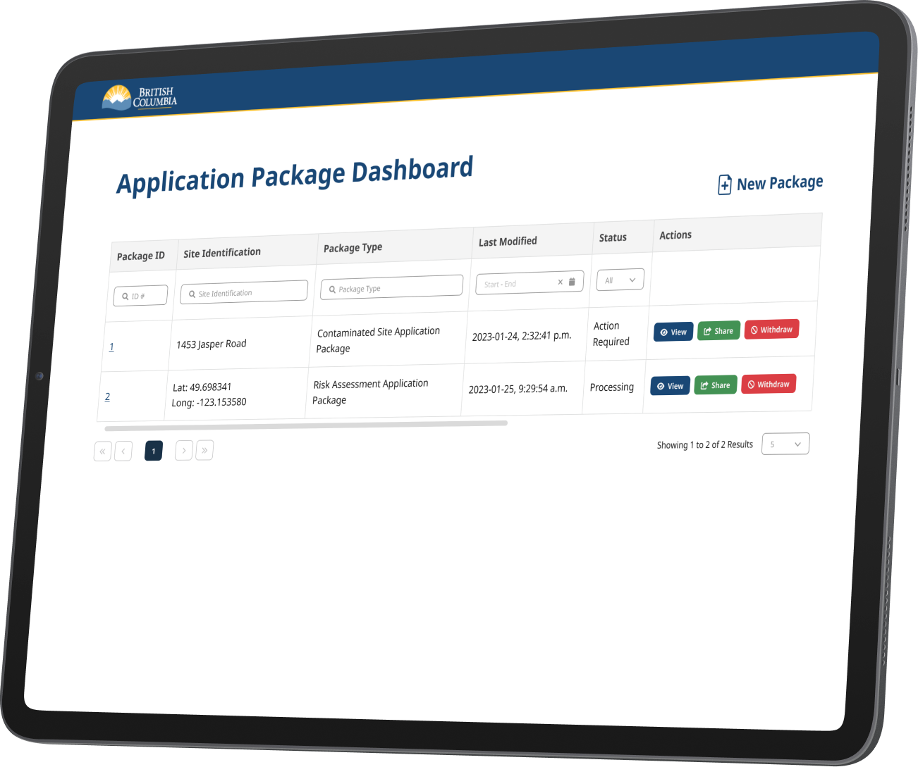
High Fidelity - External User
The high-fidelity mockups for the Create Application Package and Application Package Dashboard offer a streamlined experience for external users. The package builder guides users through each step with real-time validation and contextual help. The dashboard displays all applications submitted, in progress, or drafts with clear status indicators, filter options, and quick actions, making it easy to manage and track submissions.
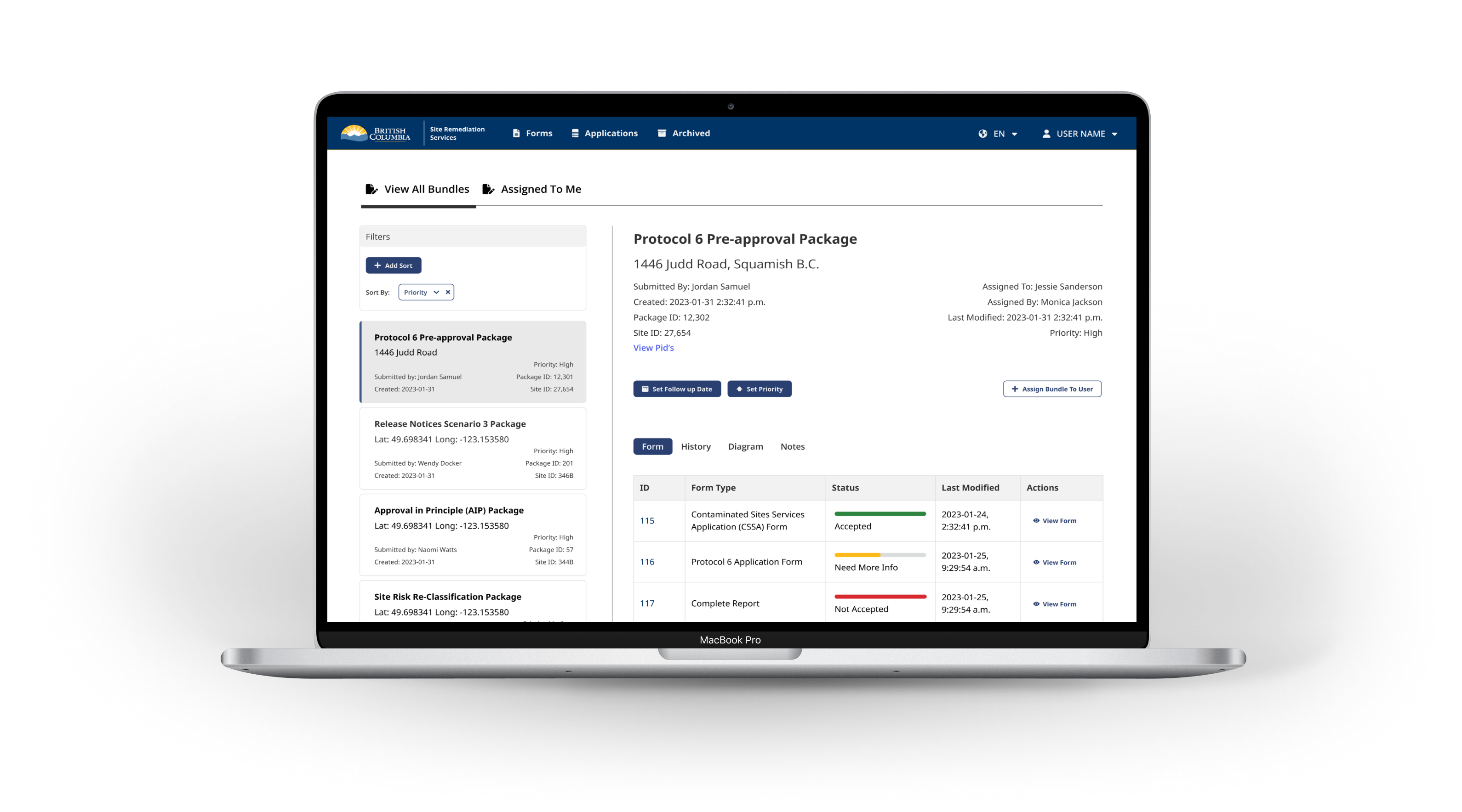
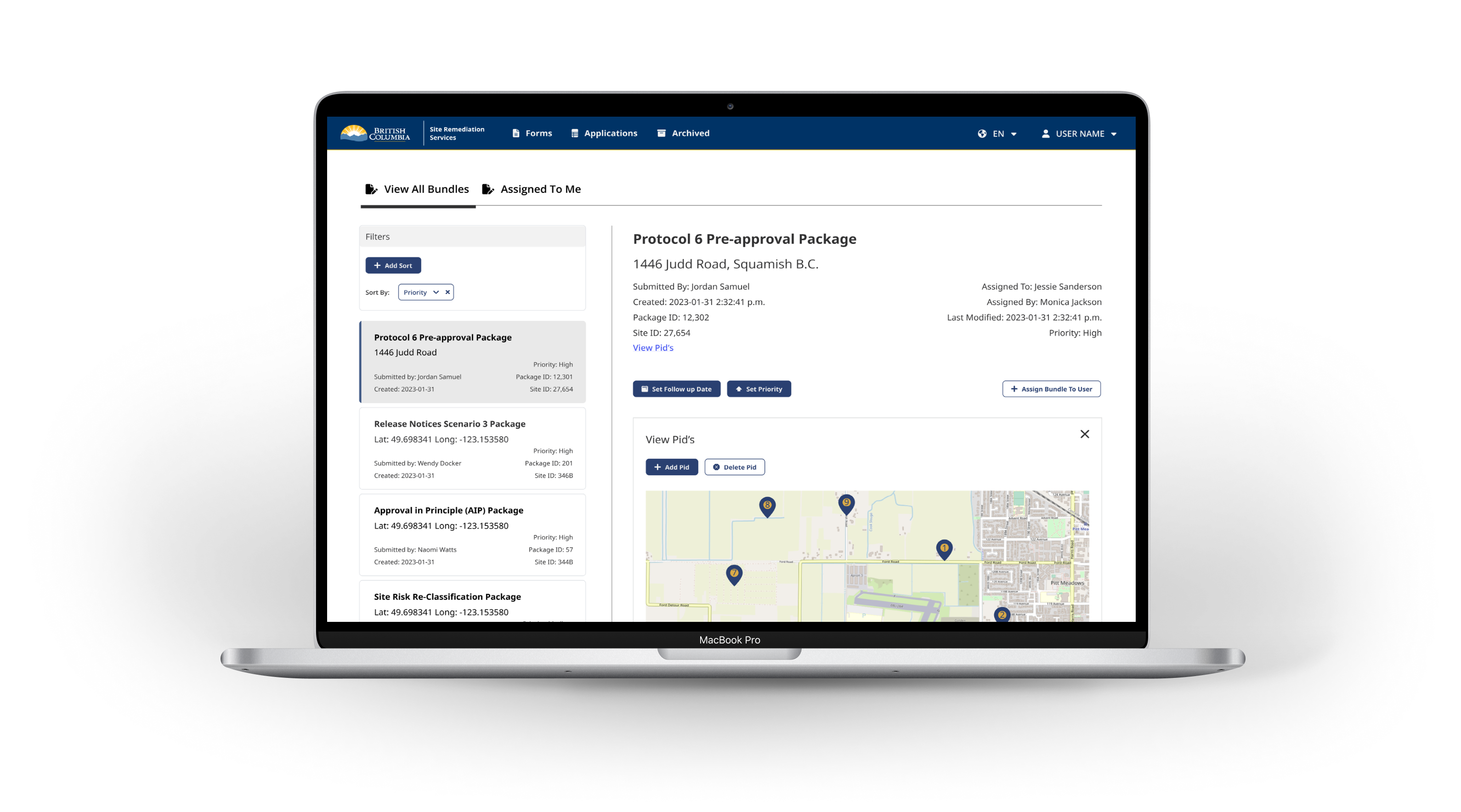
High Fidelity - Internal User
The high-fidelity pages for internal users feature an Application Dashboard optimized for clarity and operational efficiency. Each application includes real-time status indicators such as submitted, under review, or action required—helping staff quickly assess and prioritize workload. A built-in interactive map function displays location markers for each application, allowing users to visualize geographic distribution and zoom into specific areas for more detail. This spatial view is accessible directly from the dashboard and within each application record, supporting site verification and land-based decision-making without switching contexts.
Reflection
This case study highlights how user research and design thinking helped improve the application process for contaminated site services. By interviewing real users from different organizations, the team identified key problems: the process was confusing, forms were hard to use, and applicants had little insight into their application status. The new design introduced guided application tools, clearer forms, and dashboards to track progress, making it easier for applicants to know what to do and for staff to process requests efficiently. Prototyping and user testing ensured the changes met real needs, while a consistent design system kept everything accessible and user-friendly. Overall, the project shows the value of listening to users and making digital services simpler and more transparent
UX/UI Service Design Project
Ministry of Environment and Climate Change Strategy
A UX design case study on streamlining the application process for those involved in identifying, investigating, managing, or cleaning up contaminated sites.
Role & Team
Role: Sole UX/UI Service DesignerTeam: 1 Architect, 4 Developers, 1 Product Owner, 1 Product Manager
Contaminated Sites Forms
Site Remediation Services provides many services to clients. To request a service, an application is submitted. This process involves the completion, submission and acceptance of forms. It might be helpful to think of the service application package as a recipe, and the forms as some of the ingredients. Different services will require different forms (along with other submission requirements). Some forms will be common to most services, while other forms will only be required for specific types of services.
Problem Statement
How might we improve the existing LRS contaminated site services application process so that applicants are more successful in applying for LRS certification documents, and staff are more efficient with processing applications.
User Research: Who Did We Engage
I Conducted ten 45-minute virtual user interviews with a diverse group of stakeholders to uncover pain points, user goals, and contextual challenges within the contaminated site application process. These sessions provided critical qualitative insights that informed persona development, service improvement opportunities, and the overall UX strategy.Roles
Senior Manager, Operations Manager, 2 x Principles, Environmental Co-ordinator, Society President, Assistant Manager, Lands Executive Assistant, Compliance and Enforcement Officer, Senior Planner.
Gender
8 Men | 2 Women
Ages
30-40: 1 | 40-50: 8 | 50-60: 1
Organizations
City of Vancouver, City of Richmond, Sts'ailes First Nation,
Tsawwassen First Nation, Conwest Group, Thurber Engineering,
Pinchin, Keystone Environment, Williams Lake Golf Club.
Personas
As part of the Site Remediation Services UX design project, personas were developed to represent the diverse external users involved in the application process for contaminated site services. Drawing from ten 45-minute virtual interviews with professionals across government, First Nations, environmental consulting firms, and private organizations, I synthesized insights into distinct user profiles. Participants included roles such as operations managers, environmental coordinators, senior planners, and compliance officers each with varying levels of experience navigating the Land Remediation Section (LRS) application process. These personas captured user goals, pain points, workflows, and contextual needs, providing a clear lens into the challenges applicants faced, such as confusion around form requirements and inefficient submission pathways. By grounding the design process in these research-backed personas, we ensured that future service improvements would be tailored to real user needs and aligned with the problem statement: helping applicants submit more successful applications while enabling staff to process them more efficiently.
Research Key Pain Points
Content
- Complex process that is very challenging to navigate: what to do, when and why
- Uncertainty on requirements for certain applications
- Unclear on best course of action for scenarios
- Protocol 12 information importance and accessibility
- No information on warnings or triggers that can guide how to engaging with the land
Digital and Service System
- Timelines are unknown, inconsistent and too long, creating impactful delays
- Many forms are not user friendly
- No status updates on the progress of applications, reports or enforcements
- Not easy to access to the registry for all stakeholders
- No information on what and where remediation activity is happening
Culture and Context
- Centralized email, standard responses and minimal access to Ministry staff
- FAQ response times are slow
- Contact information is not easy to find
- Setting up and having a meeting takes too long
- No contact with reviewer to know if site visits occur for AIP or COC
- All applicants given the same priority: Municipality, CSAP, Citizen
- Differing standards on processing applications between generations of staff
- Disconnect with Indigenous Nations on remediation planning
- Siloed work around supporting and enforcing environmental protection
Opportunities for Improvement
Guidance & Content Clarity
- Develop a guided application wizard or decision tree tool to walk users through steps based on their scenario.
- Create visual flowcharts and timelines for each application type.
- Build interactive checklists tailored by application type.
- Offer auto-generated requirement lists after users select key service attributes.
- Provide scenario-based guidance or a self-assessment tool that suggests next steps.
- Include examples of completed applications and common pathways.
- Redesign content layout for Protocol 12 guidance and include quick-reference summaries.
- Integrate Protocol 12 requirements into digital forms or wizards with contextual tips.
- Create a centralized contact directory with filters by topic, region, or role.
- Include contact cards or quick links directly in application pages.
Digital Experience & Tools
- Redesign forms using plain language, dynamic inputs, and conditional logic.
- Offer form previews, autofill from user profiles, and in-form help prompts.
- Improve the search functionality and user interface of the public registry.
- Create role-based access and dashboards for different user types.
- Develop an online portal with real-time status tracking and notification options.
- Allow users to subscribe to updates or view a timeline of progress.
- Launch a public map of current remediation activities and project stages.
- Publish monthly or quarterly project updates for transparency.
- Build a searchable, dynamic FAQ database that updates based on user input.
- Add a chatbot or virtual assistant for instant answers on common topics.
- Introduce a public map or alert system showing environmental triggers, regulatory overlays, or sensitive zones.
- Include land use flags or notices within the application process for early guidance.
Process Transparency & Timeliness
- Display estimated timelines by application type and stage.
- Introduce a public service standard dashboard with real-time metrics.
- Add status updates that indicate if a site visit is pending, completed, or waived.
- Introduce prioritization logic based on urgency, impact, and applicant type.
- Add service tiers or expedite options based on predefined criteria.
Communication & Support
- Introduce a tiered support model with dedicated contact options by application complexity.
- Use a case management system to assign consistent staff to files.
- Offer online appointment booking with calendar integrations and auto-confirmations.
- Introduce “office hours” with drop-in slots for quick consultations.
- Allow users to message or request updates from assigned reviewers through the portal.
Wireframes & Prototyping
Prototyping for the Site Remediation Services app focused on designing tailored experiences for both internal and external users. For external users, prototypes aimed to simplify the application process by improving form usability, introducing guided workflows, and ensuring mobile responsiveness. Internal user prototypes were designed to streamline review workflows, enhance visibility into application status, and support decision-making with clearer dashboards and user notifications. Both sets of prototypes were developed iteratively in Figma, tested with target users, and aligned with accessibility standards and the BC Gov Design System to ensure usability, consistency, and scalability across platforms.
External User Wireframes
Internal User Wireframes
Design System / Component Library
As part of the Site Remediation Services project, a component library and design system was developed to ensure consistency, accessibility, and efficiency across all interfaces. The system included foundational elements such as typography, color palette, navigation components, buttons, input fields, and progress bars. It incorporated selected components from the BC Gov Design System to maintain alignment with provincial standards, while also introducing custom components tailored to the unique needs of the application process, such as multi-step form elements and contextual alerts. The library was built in Figma to support rapid prototyping, collaboration, and handoff, and served as a centralized reference for both internal and external user interface design.
High Fidelity - External User
The high-fidelity mockups for the Create Application Package and Application Package Dashboard offer a streamlined experience for external users. The package builder guides users through each step with real-time validation and contextual help. The dashboard displays all applications submitted, in progress, or drafts with clear status indicators, filter options, and quick actions, making it easy to manage and track submissions.
High Fidelity - Internal User
The high-fidelity pages for internal users feature an Application Dashboard optimized for clarity and operational efficiency. Each application includes real-time status indicators such as submitted, under review, or action required—helping staff quickly assess and prioritize workload. A built-in interactive map function displays location markers for each application, allowing users to visualize geographic distribution and zoom into specific areas for more detail. This spatial view is accessible directly from the dashboard and within each application record, supporting site verification and land-based decision-making without switching contexts.
Reflection
This case study highlights how user research and design thinking helped improve the application process for contaminated site services. By interviewing real users from different organizations, the team identified key problems: the process was confusing, forms were hard to use, and applicants had little insight into their application status. The new design introduced guided application tools, clearer forms, and dashboards to track progress, making it easier for applicants to know what to do and for staff to process requests efficiently. Prototyping and user testing ensured the changes met real needs, while a consistent design system kept everything accessible and user-friendly. Overall, the project shows the value of listening to users and making digital services simpler and more transparent